2026-09 v1.9

New AI workflow execution modes in Notebook​

We’ve added three workflow execution modes to notebooks, giving you more control over how workflows run:

  • Auto — runs the full workflow without pausing.
  • Step — pauses after each step for confirmation.
  • Intelligent — asks for input only when the agent needs it.

Choose Auto for uninterrupted execution, Step when you want to review each step, or Intelligent when you want the agent to run with minimal interruptions and ask for input only when needed.

2026-09 v1.8

We’ve added a new set of Analytics features to help you analyze trends, compare periods, and understand how individual values contribute to your data.

These features are available directly from the Analytics tab in supported visualizations.
Analytics

📊 Period Comparison​

Compare your current data with values from a previous period directly in the same visualization. With Period Comparison, you can:

  • Compare against the previous month, year, or other supported period.
  • Add multiple comparisons to the same visualization.
  • Compare the current value with a previous period.
  • View the delta between periods.
  • View the percentage change between periods.

For example, compare August 2025 with August 2024, or compare each month with the previous month. Available on: Bar, Line, Area, Combination, Table, and Pivot Table.

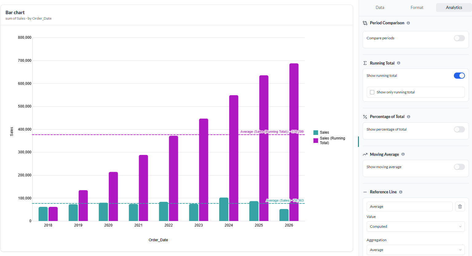
➕ Running Total​

Track cumulative values across your data with Running Total.

You can:

  • Calculate a cumulative total across your data points.
  • Display the original measure alongside the running total.
  • Choose Show only running total when you only want to see the cumulative values.

Running Total is particularly useful for tracking cumulative sales, revenue, costs, orders, or other additive metrics over time.

💯 Percentage of Total​

Understand the contribution of individual values to a total with Percentage of Total.

You can:

  • Calculate each value as a percentage of the Grand Total.
  • Create a Custom total based on selected dimensions.
  • Control which dimensions are included when calculating the total.
  • Keep the original measure alongside the percentage or show only the percentage of total.

In tables, the calculation is applied to the selected measure column and can be calculated based on the dimensions you select. Available on: Bar, Line, Area, Combination, Table, and Pivot Table.

📈 Moving Average​

Smooth out short-term fluctuations and make underlying trends easier to identify with Moving Average.

You can configure:

  • Previous — the number of preceding values to include.
  • Next — the number of following values to include.
  • Null if not enough values — controls whether a moving average is returned when the configured number of values isn't available.

Moving Average is useful for analyzing time-series data such as sales, revenue, traffic, or other metrics where short-term fluctuations can make trends difficult to see.

〰️ Reference Line​

Add a Reference Line to your chart to highlight a specific value or threshold and make it easier to compare your data against a target, benchmark, or baseline.

Available on: Bar, Line, Area, and Combination

Use it to highlight values such as targets, averages, thresholds, or benchmarks directly on your visualization.
2026-08 v1.7

Your notebook just got a lot more capable.

Until now, each cell worked the same way: you wrote a prompt, the AI responded, and you moved to the next cell. It was fast, but it was on you to string the steps together — plan the analysis, decide what to run next, and check whether the output actually made sense.

That changes today.

Agentic Notebook

What's new​

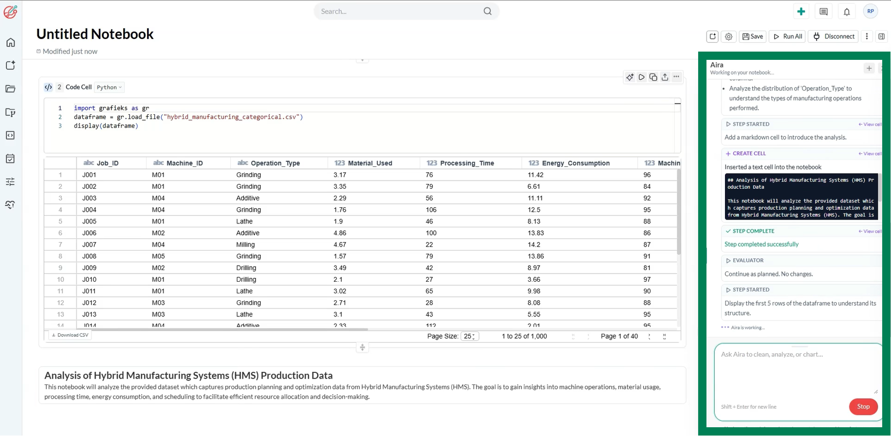
The notebook now works agentically, end to end. Instead of executing one prompt at a time, the AI can:

  • Plan — break down your goal into a sequence of steps across cells
  • Orchestrate — decide what to run, in what order, and adapt the plan as new information comes in
  • Execute — run code, transform data, and produce outputs across the notebook
  • Evaluate — check its own results, catch errors or dead ends, and self-correct before moving forward

In short: you describe the outcome you want, and the notebook figures out and carries out the path to get there.

Why it matters​

Multi-step analysis used to mean manually chaining cells together, re-running things when an earlier step turned out wrong, and eyeballing outputs for mistakes. Now the notebook handles that loop itself, planning ahead, adjusting mid-flight, and checking its own work, so you can focus on the questions you actually care about instead of the mechanics of getting there.

What stays the same​

Every cell is still visible and editable. You can inspect what the AI planned, step in at any point, tweak a cell, or take over manually — the agentic workflow doesn't hide anything from you, it just does more of the legwork by default.

Get started​

Open any notebook and give it a goal instead of a single instruction — for example, "clean this dataset, find the top drivers of churn, and chart them" — and watch it plan and work through the notebook on its own.

2026-08 v1.6

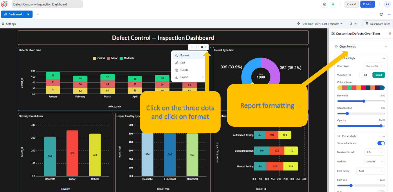
Previously, chart customization was available only from the Report Creation/Data Exploration page. With this update, you can now customize charts directly from the Dashboard Designer canvas page, making it easier to format visualizations while building your dashboard.

Chart customization

What’s New​

You can now customize chart appearance directly from the Dashboard Designer canvas page. Select a chart on the canvas to access formatting options tailored to the selected visualization.

Customization options include:

  • Data Labels: Show or hide value labels and customize their number format, position, font, size, style, and color.
  • Axes: For axis-based charts, customize X-axis and Y-axis visibility, names, fonts, colors, tick marks, and axis lines.
  • Gridlines: Control gridline visibility, style, width, and color.
  • Legend: Show or hide the legend and customize its position, font, size, style, and color.

Context-Aware Formatting​

The available formatting options automatically adapt to the selected chart type. Axis-based charts provide X-axis and Y-axis customization, while non-axis-based charts, such as pie and radar charts, display only the formatting options relevant to them.

With these enhancements, you can create dashboards that are not only more informative but also better aligned with your preferred visual style and reporting needs.

2026-08 v1.5

What's New?​

Enhanced Export & Filtering​

We’ve added new export options and improved filtering capabilities to make it easier to share, analyze, and work with your data.

1. Export Dashboards​

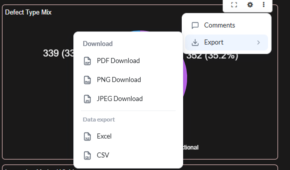
You can now export dashboards in the following formats:

  • PDF
  • PNG
  • JPG

Share dashboard insights easily in presentations, documents, or other channels.

2. Export Reports & Report Data​

Reports can now be exported as:

  • PDF
  • PNG
  • JPEG

You can also export the underlying report data for further analysis in:

  • CSV
  • Excel
3. Filter Using Calculated Fields​

Calculated fields can now be added to filters. This gives you greater flexibility to filter and analyze your data using custom calculations and business logic.

These enhancements make it easier to share insights, analyze report data, and build more flexible dashboards and reports.

Export report

2026-07 v1.4

What's New​

1. Create Reports Without Leaving Your Workbook​

Creating reports is now faster and more seamless.

Previously, selecting New Report redirected you to a separate report creation page. With this release, report creation now opens in a modal dialog directly within the workbook page, allowing you to stay in your current context while configuring and creating reports.

Benefits:

  • No page navigation or context switching.
  • Faster report creation workflow.
  • Improved user experience with an uninterrupted workbook session.

2. New Funnel Chart Templates​

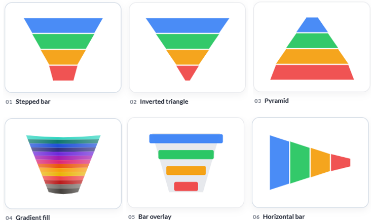
We've introduced Funnel Chart Templates to give you more flexibility in presenting funnel data. You can now choose from multiple built-in funnel styles to best match your reporting and visualization needs.

funnel chart template

Available templates include:

  1. Stepped Bar: Classic segmented funnel with uniform sections.
  2. Inverted Triangle: Traditional tapered funnel view.
  3. Pyramid: Upright pyramid-style visualization.
  4. Gradient Fill: Modern funnel with gradient styling.
  5. Bar Overlay: Layered horizontal bar presentation.
  6. Horizontal Bar: Funnel stages displayed horizontally.

Benefits:

  • Choose the visualization that best fits your business scenario.
  • Improve report readability and presentation.
  • Create more engaging dashboards with a variety of funnel styles.

These enhancements are designed to streamline report creation and provide greater flexibility when visualizing funnel-based metrics.

2026-06 v1.3

We're introducing two enhancements to improve report creation and management.

1. KPI Templates​

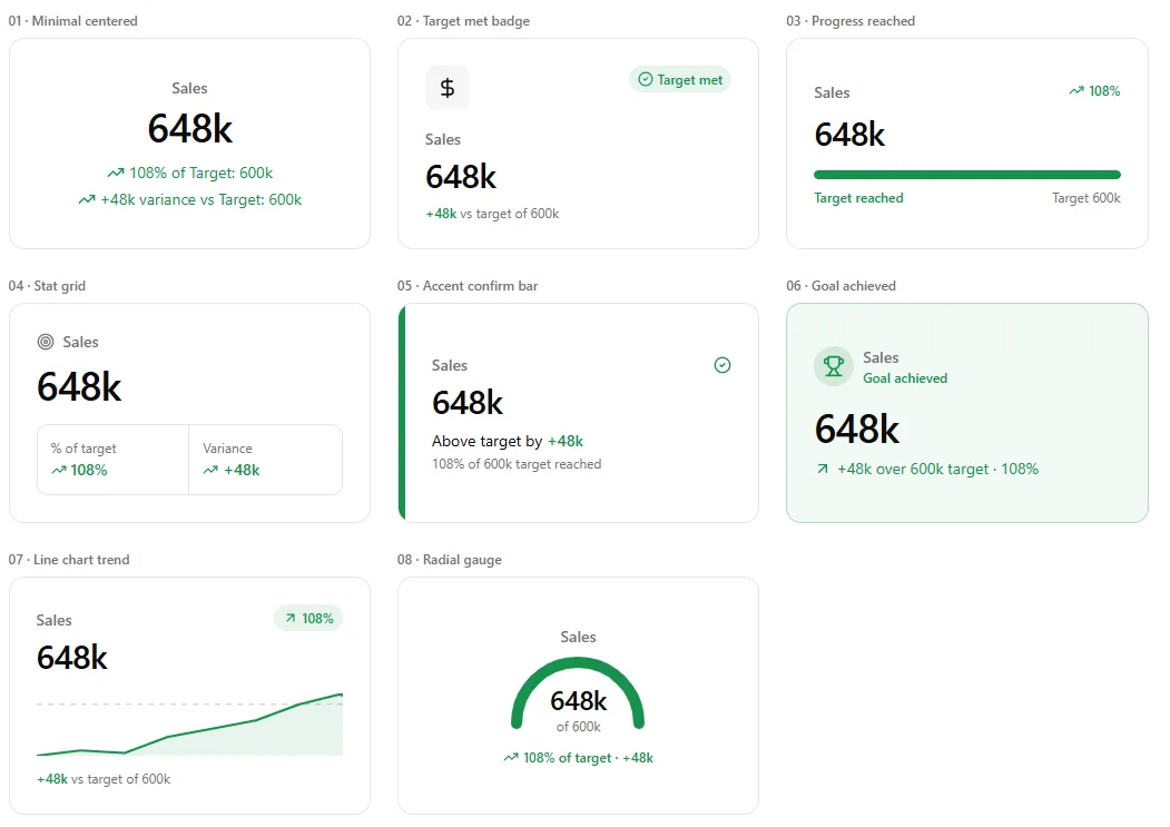
Create reports faster and more consistently with KPI Templates. Users can now define reusable KPI configurations and choose whether a KPI is based on an absolute value or a date-based value, providing more flexibility for different reporting scenarios.

kpi template

Why it matters

  • Create reports faster by reusing predefined KPI definitions.
  • CChoose between absolute values or date-based values when configuring KPIs, giving you greater flexibility to meet different reporting needs.
  • CPromote consistency across reports while reducing manual configuration and the risk of errors.

2. CTE-Based Report Generation​

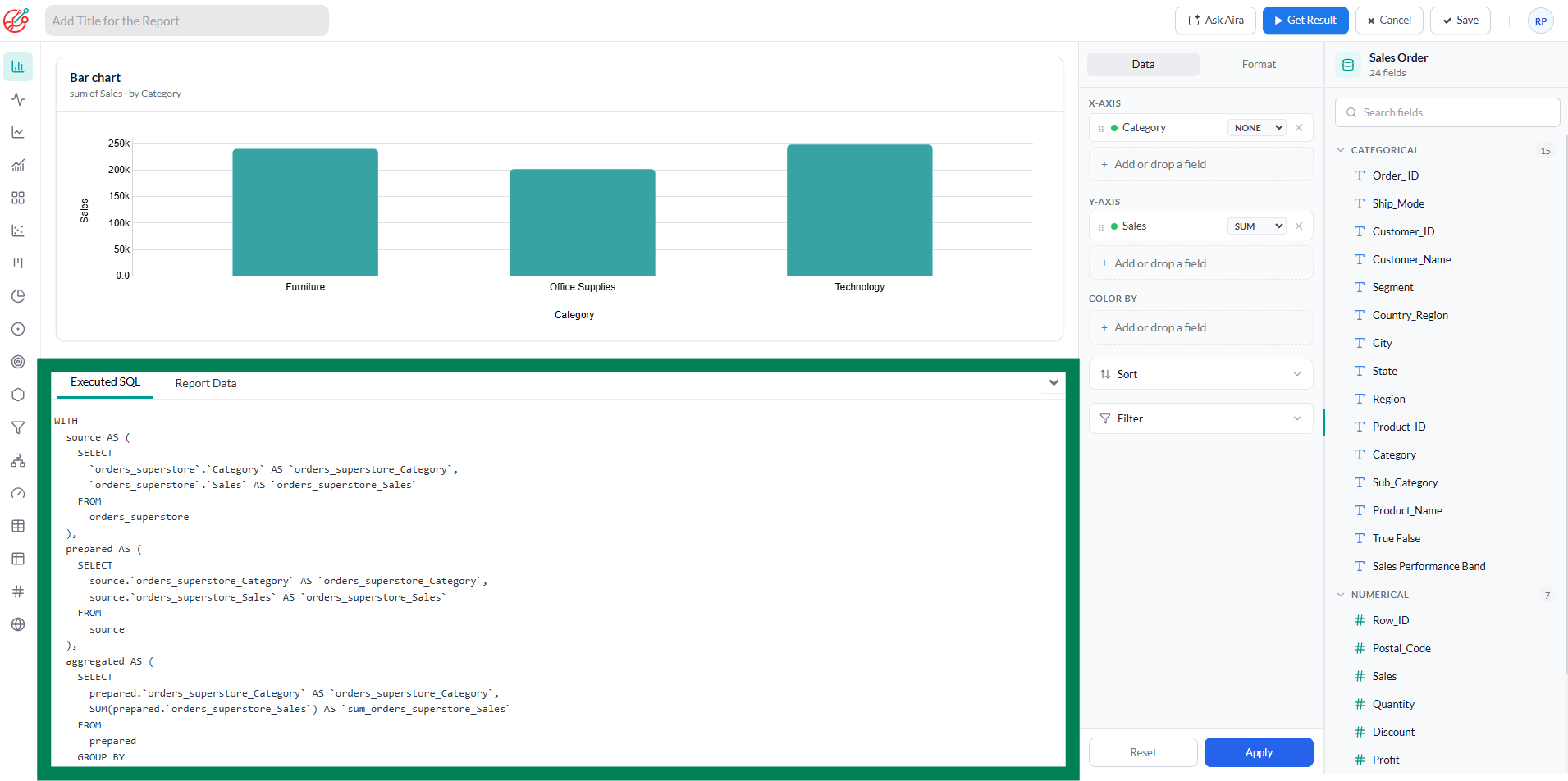
All newly generated reports now use Common Table Expressions (CTEs) as the underlying query structure. Previously, reports were generated using standard SQL queries.

CTE

Why it matters

  • Makes generated queries easier to read, understand, and maintain.
  • Provides a more scalable foundation for building complex reports.
  • Improves query organization and enables future reporting enhancements.

2026-04 v1.2

Data Notebook​

We're excited to introduce Data Notebook, a unified workspace for preparing, analyzing, and publishing data.

What’s new:​

  • SQL + Python in one place – Seamlessly switch between SQL queries and Python code within the same notebook.
  • AI-powered assistance – Get intelligent suggestions for SQL and Python while maintaining full control—AI never executes code automatically.
  • Secure sandbox – Run notebooks in an isolated environment with no external internet access, helping keep your data secure.
  • Data preparation – Clean, transform, and preprocess data using SQL or Python before publishing.
  • Direct dashboard publishing – Publish prepared datasets directly to dashboards for faster reporting and visualization.

notebook

2025-09 v1

Introducing AI-Powered Conversational Analysis​

Conversational Analysis

We’re thrilled to unveil the next evolution of Grafieks: Conversational Analysis - where interacting with your data feels just like having a conversation with an AI data analyst.

What’s new:​

  • Interactive Chat Interface: Ask questions, explore trends, and receive actionable insights in real-time through a chat-style conversation.
  • Smart Insights & Summaries: The AI doesn’t just respond—it analyzes your data and highlights key findings, patterns, and anomalies automatically.
  • Persistent Chat History: Every conversation is saved in a threaded menu, so you can revisit insights anytime.
  • SQL Transparency: Behind every insight, the AI generates SQL queries you can view, ensuring transparency and trust in your results.
  • Editable & Savable Reports: Transform chat insights into fully editable reports and save them to your dashboard for ongoing analysis.

Why it matters:​

This feature turns data exploration into an intuitive dialogue. Teams can ask questions, follow leads, and generate actionable reports—all without leaving the chat interface. It’s the fastest, most natural way to turn curiosity into decisions.

With Conversational Analysis, your AI assistant has evolved from a report builder into a trusted, interactive analyst—ready to help you discover insights faster than ever.

2025-08 v0.6

From Spreadsheet to Insights in Minutes​

Spreadsheets are everywhere—but turning them into insights is often harder than it should be. Picture this:

  • Customer survey results sitting in Excel
  • A CRM export in CSV format
  • A delivery report arriving as an email attachment

Traditionally, analyzing these files meant:

  • Raising tickets with data engineering
  • Setting up one-off ETL jobs
  • Wrestling with database access
  • Waiting hours (or days) to start exploring

Not anymore.

With Grafieks, you can now upload CSV or Excel files directly into the platform and analyze them instantly with our in-memory processing engine. And with AI, finding insights is faster than ever.

What’s New

  • CSV & Excel Import – Bring your datasets into Grafieks in just a few clicks.
  • In-Memory Analysis – No waiting around; process data instantly with Grafieks's high-performance engine.
  • Faster Insights – Explore, filter, and visualize imported data without external dependencies.

Why It Matters Until now, analysis in Grafieks was limited to connected data sources. With this release, you can upload flat files and still take advantage of Grafieks’s scalable in-memory technology, enabling you to:

  • Quickly analyze ad-hoc datasets.
  • Combine spreadsheet-based data with connected sources.
  • Empower business users to explore insights without IT support.

From inbox to insights—no pipelines, no waiting.

Import CSV

2025-05 v0.5

We’re excited to announce five powerful new features in Grafieks that significantly enhance how teams explore, understand, and communicate data. Here's what’s new:

1. AI-Powered Data Discovery​

Unlock smarter analytics with AI-powered insight prompts. Grafieks now automatically surfaces trends, anomalies, and correlations from your datasets—helping you ask better questions and spot what matters faster. Grafieks also suggests the best chart type for each insight query, so you can visualize your findings in the most effective way—instantly.

AI-Powered Insight Suggestions

AI-Powered Chart Suggestions

2. Automated Report Summaries (with Zero Data Exposure)​

No more manual summaries. Grafieks now generates natural-language report overviews—without exposing raw data. These AI-written summaries give stakeholders quick, secure access to key takeaways.

AI-Powered Chart Summary

3. Custom Fields​

You asked, we delivered. Create custom expression —no code or data team required. Define your own formulas, KPIs, and metrics using built-in functions and expressions tailored to your business needs, and see changes instantly reflected in visualizations.

Custom Field/Custom Expression

4. Native dbt core Integration​

Bring modeling and metrics to the forefront with first-class dbt Core support. Grafieks syncs your dbt projects—including models, tests, and descriptions—so your metrics are always in context and always up-to-date.

5. Unified Data Catalog​

Explore your data in one place. Our new catalog view lets users browse tables, metadata, metrics from dbt, and custom fields—all searchable, all connected. Built for discovery and governance, side by side.

Data Catalog

2025-03 v0.4

1. Conditional formatting in a Pivot Table​

You can now apply conditional formatting in a pivot table. It will enable you to highlight specific values based on conditions, making it easier to analyze data.

Pivot Conditional formatting

2. Enhanced Text Widget with a built-in Text Editor​

A new Text Editor has been introduced for the Text Widget, allowing for easier formatting and customization.

Text Editor

2025-02 v0.3

1. Geo bubble chart​

You can now use geo bubble chart to display information on a map, making it easier to analyze geographic trends and distributions.

Geo Chart

2. Pinning items to your homepage​

You can pin essential items to the homepage for easy and quick access, ensuring that frequently used items are always readily available whenever you need them. This helps improve efficiency and saves time by reducing the need to search for them manually.

Pin Items

2025-01 v0.2

1. Receive alerts based on data conditions​

You can now set up Data Alerts and get notified via email or in-app notification channel. This enhancement is designed to give you flexibility and control, making it easier to set up data alerts. Unlike other BI tool, you have two options:

i. Set up a condition without a timestamp: You can configure a condition that evaluates based on both categorical and numerical data without involving timestamps. For example, a condition might check if a product category matches a specific value (categorical) and whether the associated numerical value, such as price or quantity, exceeds a defined threshold. This allows you to set flexible conditions that work independently of time, focusing solely on the data attributes.

ii. Set up a timestamp condition: Timestamp-based conditions can be configured to evaluate only when the timestamp falls between the last run and the next run of the scheduler. For instance, this is useful in scenarios where you want to process data or trigger actions only for events or records that occurred within a specific time window, ensuring the condition is aligned with your scheduler's execution intervals.

Data Alert

2. New and improved Pivot table for live data connect​

Experience improved performance with this enhancement—pivot tables now render faster than ever. Analyze your data seamlessly without delays.

Pivot

3. Increased width of maximized report view​

This enhancement provides improved visibility for widget content, especially in report widgets, ensuring clearer and more accessible insights.

3. "All" option added in the filter​

The filter now includes an 'ALL' option, making it easier to view and analyze comprehensive data at once.

4. Real-Time Streaming Now Supported in KPI Charts and table​

KPI charts are now available for real-time streaming, enabling dynamic tracking of key performance metrics.

Real-time KPI

2024-11 v0.1

In this release we are:​

  • Ending Support for Grafieks Desktop : We will be discontinuing support for Grafieks Desktop. However, the source code will remain available on GitHub for those who wish to continue using or modifying it independently.
  • Fully Transitioning to Cloud: We’re now offering Grafieks exclusively as a cloud-based application, providing enhanced accessibility and seamless updates. This strategic move aligns with our commitment to providing you with an enhanced and seamless user experience. By transitioning to Grafieks Cloud, you will benefit from:
    1. Accessibility: Access Grafieks Cloud on any device with an internet connection.
    2. Real-time Updates: Enjoy instant updates and improvements without the need for manual installations.
    3. Collaboration: Facilitate smoother collaboration among team members regardless of their location.
    4. Security: Enhanced security measures to safeguard your data and privacy.

Features migrated from Grafieks Desktop to Grafieks Cloud:​

  1. Data connector
  2. Data modeler
  3. Report builder
  4. Dashboard builder
  5. Report and dashboard filter

New feature and enhancements:​

  1. Table update: Our new table performs excellent with large datasets. Key Features: Virtual Scrolling, Cross-Browser Compatibility, Data Export and more.

    Please be aware that this speed improvement focuses solely on the visualization rendering and does not impact query performance. However, rest assured that we are actively working on enhancing query speed as well!

    P.S. We're also working on similar enhancements for our Pivot table visualization, so stay tuned for updates!"

  2. Real-Time streaming data connector: This new connector is called Grafieks Real-time analytics. It connects Grafieks Cloud to your streaming data source, ingests data in real time, and delivers insights on live charts instantly. Users can customize the data window and set their preferred refresh rate for optimal monitoring.
    This release introduces compatibility with MySQL, with support for additional streaming data sources planned in future updates.

  3. Real-time charts:

    • Bar Chart
    • Line Chart
    • Area Chart

Deferred features for future releases​

  1. Data Import: Excel, CSV and Google Sheets