2026-09 v1.8
We’ve added a new set of Analytics features to help you analyze trends, compare periods, and understand how individual values contribute to your data.
These features are available directly from the Analytics tab in supported visualizations.
📊 Period Comparison
Compare your current data with values from a previous period directly in the same visualization. With Period Comparison, you can:
- Compare against the previous month, year, or other supported period.
- Add multiple comparisons to the same visualization.
- Compare the current value with a previous period.
- View the delta between periods.
- View the percentage change between periods.
For example, compare August 2025 with August 2024, or compare each month with the previous month. Available on: Bar, Line, Area, Combination, Table, and Pivot Table.
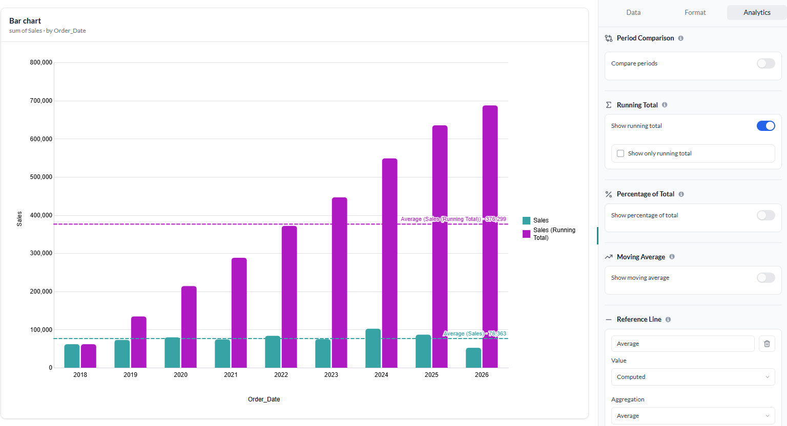
➕ Running Total
Track cumulative values across your data with Running Total.
You can:
- Calculate a cumulative total across your data points.
- Display the original measure alongside the running total.
- Choose Show only running total when you only want to see the cumulative values.
Running Total is particularly useful for tracking cumulative sales, revenue, costs, orders, or other additive metrics over time.
💯 Percentage of Total
Understand the contribution of individual values to a total with Percentage of Total.
You can:
- Calculate each value as a percentage of the Grand Total.
- Create a Custom total based on selected dimensions.
- Control which dimensions are included when calculating the total.
- Keep the original measure alongside the percentage or show only the percentage of total.
In tables, the calculation is applied to the selected measure column and can be calculated based on the dimensions you select. Available on: Bar, Line, Area, Combination, Table, and Pivot Table.
📈 Moving Average
Smooth out short-term fluctuations and make underlying trends easier to identify with Moving Average.
You can configure:
- Previous — the number of preceding values to include.
- Next — the number of following values to include.
- Null if not enough values — controls whether a moving average is returned when the configured number of values isn't available.
Moving Average is useful for analyzing time-series data such as sales, revenue, traffic, or other metrics where short-term fluctuations can make trends difficult to see.
〰️ Reference Line
Add a Reference Line to your chart to highlight a specific value or threshold and make it easier to compare your data against a target, benchmark, or baseline.
Available on: Bar, Line, Area, and Combination
Use it to highlight values such as targets, averages, thresholds, or benchmarks directly on your visualization.